import numpy as np
import matplotlib.pyplot as plt
Homework #3 — Getting Started Guide
Covariance and Linear Estimation
Understanding Covariance Matrices
The covariance matrix captures the relationship between random variables. For two variables:
\(\mathbf{K} = \begin{bmatrix} \text{Var}(X) & \text{Cov}(X,Y) \\ \text{Cov}(X,Y) & \text{Var}(Y) \end{bmatrix}\)
Consider this visualization:
def plot_covariance_example(rho, n_points=1000):
    """Demonstrate covariance with correlation rho"""
    mean = [0, 0]
    cov = [[1, rho], [rho, 1]]

    data = np.random.multivariate_normal(mean, cov, n_points)

    fig, (ax1, ax2) = plt.subplots(1, 2, figsize=(12, 5))

    # Scatter plot
    ax1.scatter(data[:, 0], data[:, 1], alpha=0.5)
    ax1.set_title(f'Sample Data (ρ = {rho})')
    ax1.set_xlabel('X')
    ax1.set_ylabel('Y')
    ax1.grid(True)
    ax1.axis('equal')

    # Density visualization
    H, xedges, yedges = np.histogram2d(data[:, 0], data[:, 1], bins=20)
    ax2.imshow(H.T, origin='lower', extent=[xedges[0], xedges[-1],
                                          yedges[0], yedges[-1]])
    ax2.set_title('Density Heatmap')
    ax2.set_xlabel('X')
    ax2.set_ylabel('Y')

    plt.tight_layout()
    plt.show()

# Show different correlation structures
for rho in [-0.8, 0, 0.8]:
    plot_covariance_example(rho)
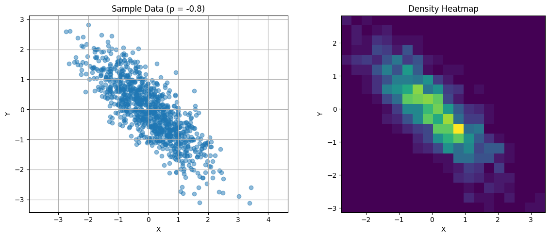
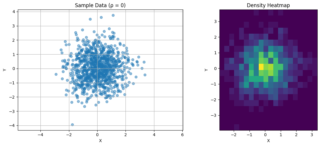
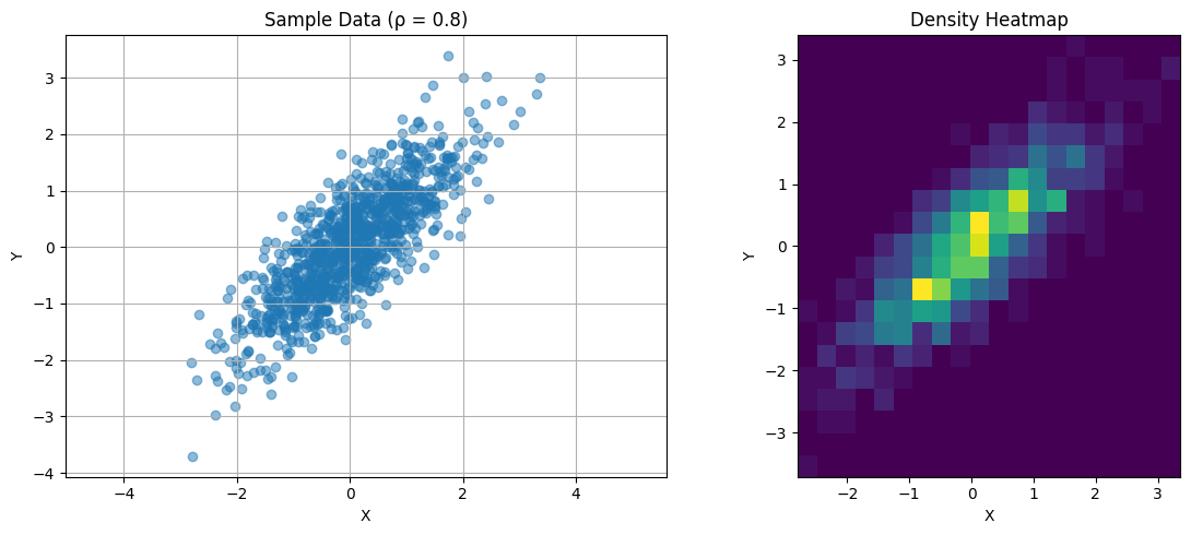
Key observations:
- Diagonal elements represent individual variances
- Off-diagonal elements capture linear relationships
- Symmetric by definition
- Positive semi-definite (all eigenvalues ≥ 0)
Eigenanalysis of Covariance
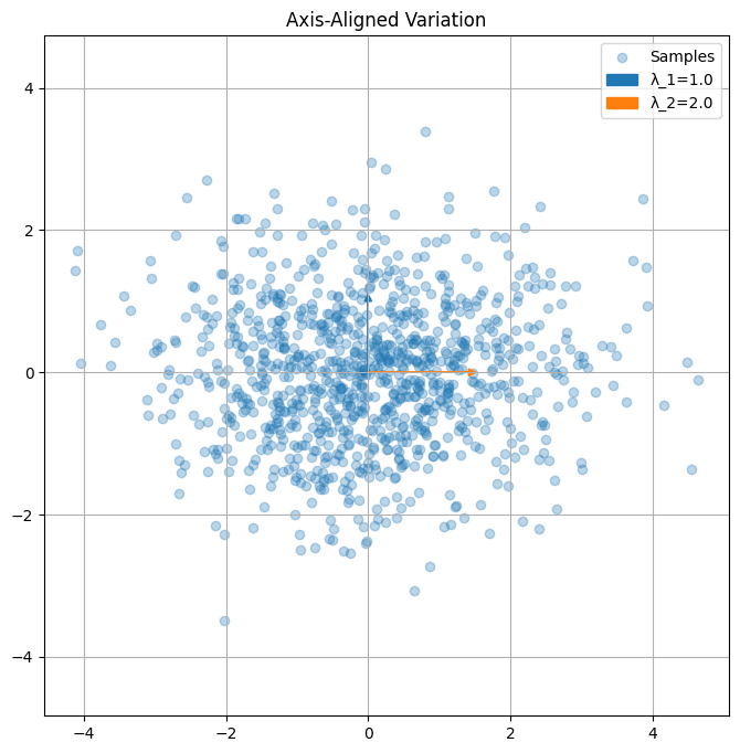
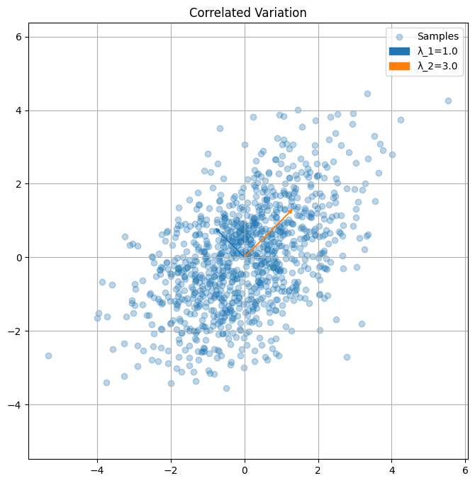
The eigendecomposition reveals principal directions of variation:
def plot_covariance_directions(cov, title="Covariance Directions"):
    """Visualize principal directions of covariance matrix"""
    eigenvals, eigenvecs = np.linalg.eigh(cov)

    n_points = 1000
    data = np.random.multivariate_normal([0,0], cov, n_points)

    plt.figure(figsize=(8,8))
    plt.scatter(data[:,0], data[:,1], alpha=0.3, label='Samples')

    # Plot eigenvectors scaled by eigenvalues
    for i in range(2):
        vec = eigenvecs[:,i] * np.sqrt(eigenvals[i])
        plt.arrow(0, 0, vec[0], vec[1], color=f'C{i}',
                 head_width=0.1, head_length=0.1,
                 label=f'λ_{i+1}={eigenvals[i]:.1f}')

    plt.axis('equal')
    plt.grid(True)
    plt.legend()
    plt.title(title)
    plt.show()

# Example covariance matrices
K1 = np.array([[2, 0], [0, 1]])  # Axis-aligned
K2 = np.array([[2, 1], [1, 2]])  # Correlated

plot_covariance_directions(K1, "Axis-Aligned Variation")
plot_covariance_directions(K2, "Correlated Variation")
Linear MMSE Estimation
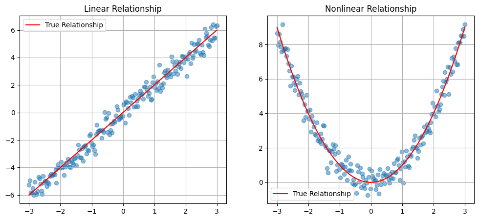
Linear estimation finds the best linear approximation:
n_points = 200
x = np.linspace(-3, 3, n_points)
y_linear = 2*x + np.random.normal(0, 0.5, n_points)
y_nonlinear = x**2 + np.random.normal(0, 0.5, n_points)

fig, (ax1, ax2) = plt.subplots(1, 2, figsize=(12,5))

ax1.scatter(x, y_linear, alpha=0.5)
ax1.plot(x, 2*x, 'r-', label='True Relationship')
ax1.set_title('Linear Relationship')
ax1.grid(True)
ax1.legend()

ax2.scatter(x, y_nonlinear, alpha=0.5)
ax2.plot(x, x**2, 'r-', label='True Relationship')
ax2.set_title('Nonlinear Relationship')
ax2.grid(True)
ax2.legend()

plt.show()
Principal Component Analysis
import numpy as np
import matplotlib.pyplot as plt
Geometric Interpretation
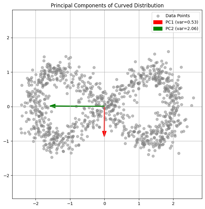
PCA finds orthogonal directions of maximum variance:
def generate_banana_data(n_points=1000):
    """Generate curved 2D distribution"""
    t = np.linspace(0, 2*np.pi, n_points)
    x = 2*np.cos(t) + np.random.normal(0, 0.2, n_points)
    y = np.sin(2*t) + np.random.normal(0, 0.2, n_points)
    return np.column_stack([x, y])

data = generate_banana_data()
mean = np.mean(data, axis=0)
centered = data - mean
cov = np.cov(centered.T)
eigenvals, eigenvecs = np.linalg.eigh(cov)

plt.figure(figsize=(8,8))
plt.scatter(data[:,0], data[:,1], alpha=0.5, color='gray', label='Data Points')

colors = ['red', 'green']
for i in range(2):
    vec = eigenvecs[:,i] * np.sqrt(eigenvals[i])
    plt.arrow(mean[0], mean[1], vec[0], vec[1],
             color=colors[i], head_width=0.1, linewidth=2,
             label=f'PC{i+1} (var={eigenvals[i]:.2f})')

plt.axis('equal')
plt.grid(True)
plt.legend()
plt.title('Principal Components of Curved Distribution')
plt.show()
Dimensionality Reduction
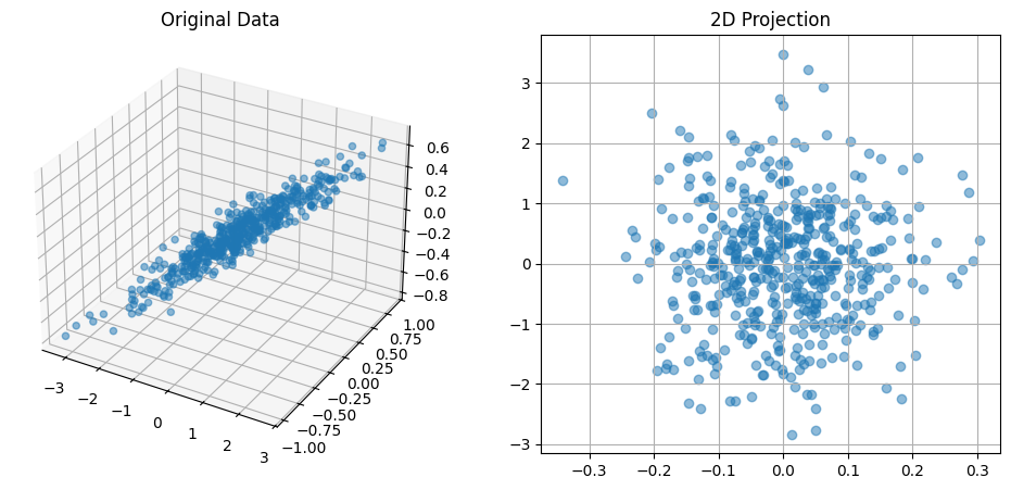
PCA allows optimal linear dimensionality reduction:
# 3D example
from mpl_toolkits.mplot3d import Axes3D

def plot_3d_reduction():
    # Generate 3D data primarily in 2D plane
    n_points = 500
    X = np.random.normal(0, 1, n_points)
    Y = 0.3*X + np.random.normal(0, 0.1, n_points)
    Z = 0.2*X + 0.1*Y + np.random.normal(0, 0.1, n_points)
    data = np.column_stack([X, Y, Z])

    # PCA
    mean = np.mean(data, axis=0)
    centered = data - mean
    cov = np.cov(centered.T)
    eigenvals, eigenvecs = np.linalg.eigh(cov)

    # Plot
    fig = plt.figure(figsize=(12,5))
    ax1 = fig.add_subplot(121, projection='3d')
    ax1.scatter(X, Y, Z, alpha=0.5)
    ax1.set_title('Original Data')

    # Project onto first two PCs
    proj = centered @ eigenvecs[:,-2:]
    ax2 = fig.add_subplot(122)
    ax2.scatter(proj[:,0], proj[:,1], alpha=0.5)
    ax2.set_title('2D Projection')
    ax2.grid(True)

    plt.show()

    print("Eigenvalues (variance explained):")
    print(eigenvals)

plot_3d_reduction()
Eigenvalues (variance explained):
[0.0080639  0.01022783 1.04396577]
Polynomial Regression
import numpy as np
import matplotlib.pyplot as plt
Design Matrix Construction
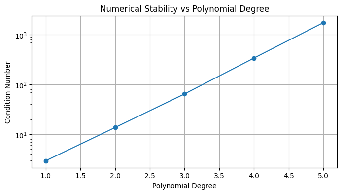
The design matrix structure affects numerical stability:
def plot_design_matrix_condition(max_degree=5):
    """Show condition number growth"""
    x = np.linspace(-1, 1, 100)
    conditions = []

    for degree in range(1, max_degree+1):
        # Construct design matrix
        X = np.vstack([x**p for p in range(degree+1)]).T
        # Compute condition number
        cond = np.linalg.cond(X.T @ X)
        conditions.append(cond)

    plt.figure(figsize=(8,4))
    plt.semilogy(range(1, max_degree+1), conditions, 'o-')
    plt.grid(True)
    plt.xlabel('Polynomial Degree')
    plt.ylabel('Condition Number')
    plt.title('Numerical Stability vs Polynomial Degree')
    plt.show()

plot_design_matrix_condition()
Regularization Effects
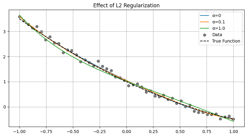
L2 regularization stabilizes the solution:
# Generate noisy polynomial data
x = np.linspace(-1, 1, 50)
y_true = 1 - 2*x + 0.5*x**2
y = y_true + np.random.normal(0, 0.1, len(x))

# Fit polynomials with different regularization
def fit_polynomial(x, y, degree=2, alpha=0.0):
    X = np.vstack([x**p for p in range(degree+1)]).T
    XtX = X.T @ X
    if alpha > 0:
        XtX += alpha * np.eye(XtX.shape[0])
    w = np.linalg.solve(XtX, X.T @ y)
    return w

plt.figure(figsize=(10,5))
x_fine = np.linspace(-1, 1, 200)
X_fine = np.vstack([x_fine**p for p in range(5+1)]).T

for alpha in [0, 0.1, 1.0]:
    w = fit_polynomial(x, y, degree=5, alpha=alpha)
    y_pred = X_fine @ w
    plt.plot(x_fine, y_pred, label=f'α={alpha}')

plt.scatter(x, y, color='black', alpha=0.5, label='Data')
plt.plot(x_fine, 1 - 2*x_fine + 0.5*x_fine**2, 'k--',
         label='True Function')
plt.grid(True)
plt.legend()
plt.title('Effect of L2 Regularization')
plt.show()
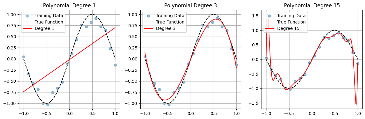
Bias-Variance Tradeoff
Model complexity affects both bias and variance:
def plot_complexity_tradeoff():
    # Generate training and test data
    np.random.seed(42)
    x_train = np.linspace(-1, 1, 20)
    y_train = np.sin(np.pi*x_train) + np.random.normal(0, 0.1, len(x_train))

    x_test = np.linspace(-1, 1, 100)
    y_test = np.sin(np.pi*x_test)

    # Fit polynomials of different degrees
    degrees = [1, 3, 15]
    plt.figure(figsize=(12,4))

    for i, degree in enumerate(degrees):
        X_train = np.vstack([x_train**p for p in range(degree+1)]).T
        w = np.linalg.solve(X_train.T @ X_train, X_train.T @ y_train)

        X_test = np.vstack([x_test**p for p in range(degree+1)]).T
        y_pred = X_test @ w

        plt.subplot(1,3,i+1)
        plt.scatter(x_train, y_train, alpha=0.5, label='Training Data')
        plt.plot(x_test, y_test, 'k--', label='True Function')
        plt.plot(x_test, y_pred, 'r-', label=f'Degree {degree}')
        plt.grid(True)
        plt.legend()
        plt.title(f'Polynomial Degree {degree}')

    plt.tight_layout()
    plt.show()

plot_complexity_tradeoff()