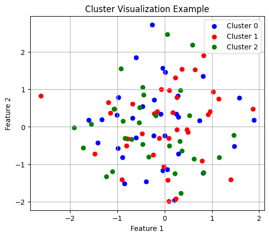
When visualizing clustering results, using distinct colors helps identify group boundaries:
# Example of visualizing clusters with appropriate colorsnp.random.seed(42)x=np.random.randn(100,2)# Random 2D pointslabels=np.random.randint(0,3,100)# Random cluster assignmentsplt.figure(figsize=(6,5))colors=['blue','red','green']fori,colorinenumerate(colors):plt.scatter(x[labels==i,0],x[labels==i,1],color=color,label=f'Cluster {i}')plt.legend()plt.grid(True)plt.title("Cluster Visualization Example")plt.xlabel("Feature 1")plt.ylabel("Feature 2")plt.show()
Visualization of cluster assignments with color coding
Confusion Matrix Interpretation
Confusion matrices help evaluate clustering quality but require careful interpretation since cluster indices may not match true class labels:
# Example of creating and interpreting a confusion matrixtrue_labels=np.array(['A','A','B','B','C','C','A','B','C'])pred_labels=np.array([0,0,1,1,2,2,0,2,1])# Arbitrary cluster indices# Count occurrencesconfusion=pd.DataFrame({0:[3,0,0],1:[0,2,1],2:[0,1,2]},index=['A','B','C'])print("Confusion Matrix (rows: true labels, columns: predicted clusters):")print(confusion)
Confusion Matrix (rows: true labels, columns: predicted clusters):
   0  1  2
A  3  0  0
B  0  2  1
C  0  1  2
Gaussian Mixture Models and EM
Understanding the Multivariate Gaussian
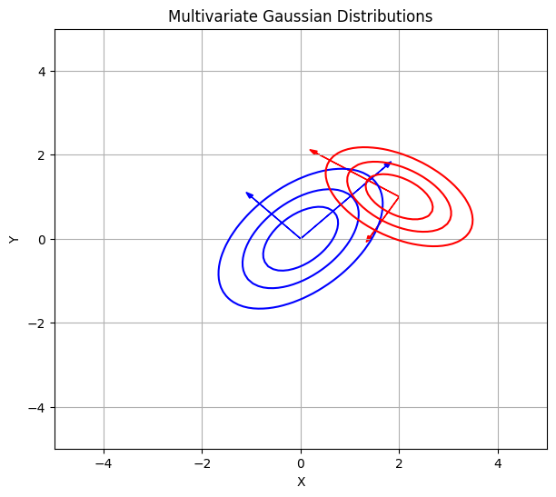
The multivariate Gaussian probability density function forms the foundation of GMM:
# Visualize 2D Gaussian distributionsdefplot_gaussian(mean,cov,color='blue',ax=None):ifaxisNone:fig,ax=plt.subplots(figsize=(6,6))# Generate grid of pointsx,y=np.meshgrid(np.linspace(-5,5,100),np.linspace(-5,5,100))pos=np.dstack((x,y))# Calculate multivariate normal PDFdet=np.linalg.det(cov)norm_const=1.0/(2.0*np.pi*np.sqrt(det))inv_cov=np.linalg.inv(cov)result=np.zeros_like(x)foriinrange(x.shape[0]):forjinrange(x.shape[1]):x_centered=pos[i,j,:]-meanresult[i,j]=norm_const*np.exp(-0.5*x_centered.T@inv_cov@x_centered)# Plot contourslevels=np.linspace(0,result.max(),5)ax.contour(x,y,result,levels=levels,colors=color)# Plot eigenvalue directionseigenvalues,eigenvectors=np.linalg.eigh(cov)foriinrange(len(eigenvalues)):length=np.sqrt(eigenvalues[i])*2ax.arrow(mean[0],mean[1],eigenvectors[0,i]*length,eigenvectors[1,i]*length,head_width=0.1,color=color)returnax# Example usagemean1=np.array([0,0])cov1=np.array([[1,0.5],[0.5,1]])mean2=np.array([2,1])cov2=np.array([[0.8,-0.3],[-0.3,0.5]])fig,ax=plt.subplots(figsize=(7,6))plot_gaussian(mean1,cov1,'blue',ax)plot_gaussian(mean2,cov2,'red',ax)ax.grid(True)ax.set_xlim(-5,5)ax.set_ylim(-5,5)ax.set_xlabel("X")ax.set_ylabel("Y")ax.set_title("Multivariate Gaussian Distributions")plt.show()
Contour plots of two 2D Gaussian distributions with principal directions
Mixture Models: “Patching the Bumps”
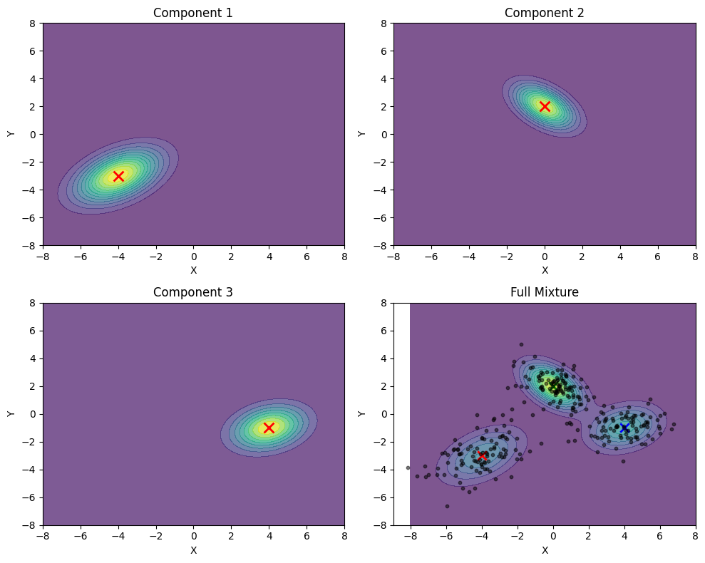
Gaussian Mixture Models combine multiple Gaussian components to represent complex data distributions:
# Demonstrate a 3-component GMM in 2Ddefplot_gmm_components():# Create gridx=np.linspace(-8,8,100)y=np.linspace(-8,8,100)X,Y=np.meshgrid(x,y)pos=np.empty(X.shape+(2,))pos[:,:,0]=Xpos[:,:,1]=Y# Define 3 Gaussian componentsmeans=[np.array([-4,-3]),np.array([0,2]),np.array([4,-1])]covs=[np.array([[2,0.8],[0.8,1.5]]),np.array([[1,-0.5],[-0.5,1]]),np.array([[1.5,0.3],[0.3,1]])]weights=[0.3,0.4,0.3]# Mixing weights# Create individual Gaussiansrv1=multivariate_normal(means[0],covs[0])rv2=multivariate_normal(means[1],covs[1])rv3=multivariate_normal(means[2],covs[2])# Create figure with subplotsfig,axs=plt.subplots(2,2,figsize=(10,8))# Plot individual componentscomponent_pdfs=[]titles=["Component 1","Component 2","Component 3","Full Mixture"]components=[rv1.pdf(pos),rv2.pdf(pos),rv3.pdf(pos),weights[0]*rv1.pdf(pos)+weights[1]*rv2.pdf(pos)+weights[2]*rv3.pdf(pos)]# Random sample data from the mixturenp.random.seed(42)n_samples=300mixture_samples=[]# Draw samples from the mixturefor_inrange(n_samples):# Choose component based on weightscomponent=np.random.choice(3,p=weights)# Draw from selected componentifcomponent==0:sample=np.random.multivariate_normal(means[0],covs[0])elifcomponent==1:sample=np.random.multivariate_normal(means[1],covs[1])else:sample=np.random.multivariate_normal(means[2],covs[2])mixture_samples.append(sample)mixture_samples=np.array(mixture_samples)# Plot each component and the mixturefori,(ax,pdf,title)inenumerate(zip(axs.flat,components,titles)):contour=ax.contourf(X,Y,pdf,cmap='viridis',alpha=0.7,levels=12)ax.set_title(title)ax.set_xlabel('X')ax.set_ylabel('Y')# Add component meansifi<3:ax.scatter(means[i][0],means[i][1],color='red',s=100,marker='x',linewidth=2)else:# In the full mixture plot, show all means and the data pointsforj,meaninenumerate(means):ax.scatter(mean[0],mean[1],color=['r','g','b'][j],s=80,marker='x',linewidth=2)# Add the mixture data pointsax.scatter(mixture_samples[:,0],mixture_samples[:,1],color='black',s=10,alpha=0.5)plt.tight_layout()plt.show()plot_gmm_components()
Visualization of a three-component Gaussian Mixture Model
1D Model Fitting Examples
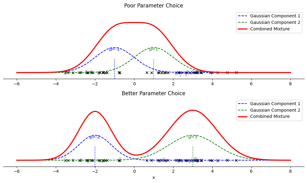
Visualizing how GMM fits data on a number line helps understand parameter selection:
# 1D GMM example with number line visualizationdefplot_1d_gmm_numberline():# Generate data from mixture of 1D Gaussiansnp.random.seed(42)n_samples=50# Fewer samples for clarity# True distribution: mixture of two Gaussiansx1=np.random.normal(-2,0.8,int(0.4*n_samples))x2=np.random.normal(3,1.2,int(0.6*n_samples))x=np.concatenate([x1,x2])# Plotting rangex_range=np.linspace(-6,8,1000)fig,(ax1,ax2)=plt.subplots(2,1,figsize=(10,6))# Poor parameter choicesmeans_poor=[-1,1]variances_poor=[1,1]weights_poor=[0.5,0.5]# Better parameter choicesmeans_good=[-2,3]variances_good=[0.7,1.5]weights_good=[0.4,0.6]# Function to plot each casedefplot_gmm_case(ax,means,variances,weights,title):# Plot the data points on number lineax.plot(x,np.zeros_like(x),'kx',markersize=6)# Small jitter for visibilityax.plot(x,np.random.normal(0,0.02,size=len(x)),'kx',alpha=0.3,markersize=4)# Plot distributionspdf_total=np.zeros_like(x_range)foriinrange(2):# Component curvecomponent=weights[i]*1/np.sqrt(2*np.pi*variances[i])* \
np.exp(-(x_range-means[i])**2/(2*variances[i]))pdf_total+=component# Scale components for visibilityscaled_component=0.4*component/np.max(component)ax.plot(x_range,scaled_component,'--',linewidth=1.5,color=['blue','green'][i],label=f'Gaussian Component {i+1}')# Mark the meanax.axvline(x=means[i],ymax=0.3,linestyle=':',color=['blue','green'][i])ax.text(means[i],0.35,f'μ={means[i]}',color=['blue','green'][i],horizontalalignment='center')# Plot the full mixture (scaled)scaled_total=0.8*pdf_total/np.max(pdf_total)ax.plot(x_range,scaled_total,'r-',linewidth=2.5,label='Combined Mixture')# Set title and labelsax.set_title(title)ax.set_yticks([])ax.spines['left'].set_visible(False)ax.spines['right'].set_visible(False)ax.spines['top'].set_visible(False)ax.set_ylim(-0.1,1)ax.legend(loc='upper right')# Plot each caseplot_gmm_case(ax1,means_poor,variances_poor,weights_poor,'Poor Parameter Choice')plot_gmm_case(ax2,means_good,variances_good,weights_good,'Better Parameter Choice')# X-axis label only on bottom plotax2.set_xlabel('x')plt.tight_layout()plt.show()plot_1d_gmm_numberline()
Comparing poor and good GMM parameter choices for 1D data
Convergence Monitoring
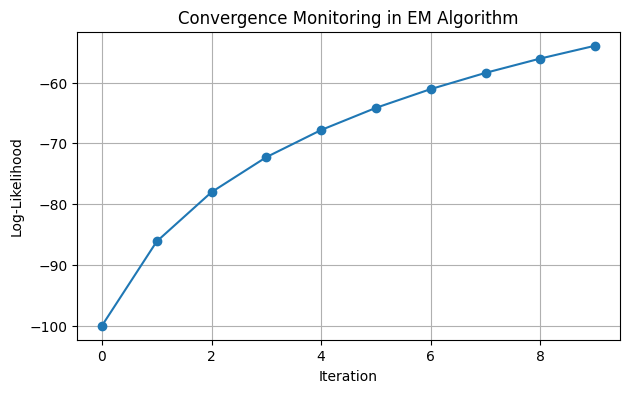
The EM algorithm’s convergence can be monitored through log-likelihood:
# Simple log-likelihood plot exampleiterations=np.arange(10)log_likelihood=-100+20*np.log(iterations+1)# Simulated valuesplt.figure(figsize=(7,4))plt.plot(iterations,log_likelihood,'o-')plt.xlabel('Iteration')plt.ylabel('Log-Likelihood')plt.grid(True)plt.title('Convergence Monitoring in EM Algorithm')plt.show()
Example of log-likelihood convergence in EM algorithm
One-Hot Initialization from K-Means
K-Means results provide an effective initialization for GMM:
# Simplified example of converting K-Means labels to one-hot probabilitieskmeans_labels=np.array([0,0,1,1,2,2,0,1,2])n_samples=len(kmeans_labels)n_clusters=3# Initialize with one-hot encodinggamma=np.zeros((n_samples,n_clusters))foriinrange(n_samples):gamma[i,kmeans_labels[i]]=1.0print("Initial gamma matrix (one-hot encoding of cluster assignments):")print(gamma[:4])# First few rows
Covariance matrices in EM may become ill-conditioned:
# Example of regularizing a covariance matrixcov=np.array([[0.1,0.09],[0.09,0.1]])# Nearly singular matrixprint(f"Original condition number: {np.linalg.cond(cov):.1f}")# Add small constant to diagonalepsilon=1e-5cov_reg=cov+np.eye(2)*epsilonprint(f"Regularized condition number: {np.linalg.cond(cov_reg):.1f}")
Original condition number: 19.0
Regularized condition number: 19.0
Working with HDF5 Files
Introduction to HDF5
HDF5 (Hierarchical Data Format version 5) provides an efficient way to store and access structured data. It supports storage of multiple arrays within a single file with fast random access.
Basic File Operations
Understanding HDF5 file structure helps when working with stored data:
defdemonstrate_hdf5_basics():"""Show basic HDF5 file operations"""# Create sample datadata1=np.random.rand(5,10)data2=np.random.randint(0,2,size=(3,5))# Binary data# Write to HDF5 filewithh5py.File('example.h5','w')asf:# Create datasets with different namesf.create_dataset('float_array',data=data1)f.create_dataset('binary_array',data=data2)# Add metadata as attributesf['float_array'].attrs['description']='Random float values'f['binary_array'].attrs['description']='Random binary values'# Read from HDF5 filewithh5py.File('example.h5','r')asf:# List all datasetsprint("Datasets in file:",list(f.keys()))# Access datafloat_data=f['float_array'][:]binary_data=f['binary_array'][:]# Read attributesprint("Float array description:",f['float_array'].attrs['description'])# Print shapesprint("Float array shape:",float_data.shape)print("Binary array shape:",binary_data.shape)demonstrate_hdf5_basics()
HDF5’s key advantage is efficient access to selected portions of data:
defdemonstrate_random_access():"""Show efficient random access to HDF5 data"""# Create a larger datasetlarge_data=np.random.rand(1000,50)# Write to filewithh5py.File('large_example.h5','w')asf:f.create_dataset('large_array',data=large_data)# Access specific elementswithh5py.File('large_example.h5','r')asf:dataset=f['large_array']# Get specific indicesindices=[5,120,342,867]selected_rows=dataset[indices]print(f"Shape of full dataset: {dataset.shape}")print(f"Shape of selected rows: {selected_rows.shape}")# Get specific regionregion=dataset[200:205,10:15]print(f"Shape of region: {region.shape}")demonstrate_random_access()
Shape of full dataset: (1000, 50)
Shape of selected rows: (4, 50)
Shape of region: (5, 5)